
While I love working with online and public datasets, it’s always fun to work with my own data. My iPhone is always with me and has been recording walking distance and steps. I rarely left my apartment since the quarantine began in March, so I thought it would be interesting to see the change in my walking distance from 2016 to 2020.
Export Data
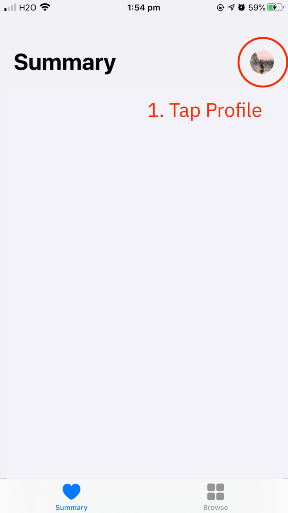
- Launch Health app on your iOS device
- Tap profile photo on the top right corner
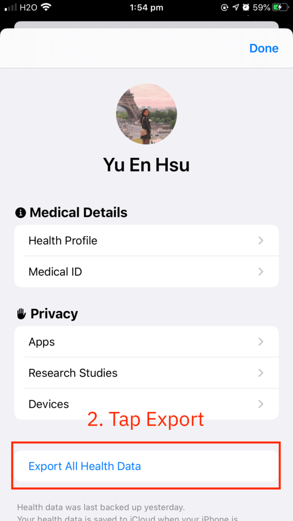
- Scroll down and tap Export All Health Data
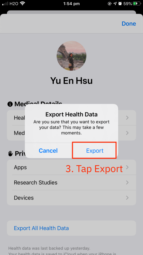
- Tap Export and wait
- Save data (I use AirDrop to transfer the file to my MacBook)
The process generates an export.zip file. One unzipped, it contains a folder called apple_health_export with two .xml files. export.xml is the file that I will be working with.
Organise Data
XML (Extensible Markup Language) is a data file. It is formatted much like an HTML document but uses custom tags to define objects and the data within each object. Atom and VSCode can both read XML files.
Here is a snapshot of the export.xml file. The record type, HKQuantityTypeIdentifierDietaryWater , refers to my water intake. The entry also documents the source application, date, value, unit, etc.
<Record type="HKQuantityTypeIdentifierDietaryWater" sourceName="Flo" sourceVersion="4.10.3.1" unit="mL" creationDate="2018-09-18 10:59:02 -0500" startDate="2018-09-17 11:00:00 -0500" endDate="2018-09-17 11:00:00 -0500" value="500">
	<Record type="HKQuantityTypeIdentifierDietaryWater" sourceName="Shortcuts" sourceVersion="754" unit="mL" creationDate="2019-01-23 21:16:36 -0500" startDate="2019-01-23 21:16:36 -0500" endDate="2019-01-23 21:16:36 -0500" value="300"/>
I needed to first transform the tag-based XML file to other formats that are easier to work with for me. xmltodict is a Python module that makes working with XML feel like you are working with JSON, as stated in the documentation. I installed the module via pip using $pip install xmltodict command.
Here’s my code for parsing XML data and organising data frame.
import xmltodict
import json
import numpy as np
import pandas as pd

#Parse XML to dictionary
with open('export.xml') as f:
    health = xmltodict.parse(f.read())

#Extract desired data and turn into a Data Frame
data = pd.DataFrame(health['HealthData']['Record'])

#Create two Data Frames for distance and steps walked
distance = data[data['@type'] == 'HKQuantityTypeIdentifierDistanceWalkingRunning'][['@value','@creationDate','@startDate','@endDate']]
step = data[data['@type'] == 'HKQuantityTypeIdentifierStepCount'][['@value','@creationDate','@startDate','@endDate']]

#Turn the kilometers into float data type from object and others into datetime
distance['@value'] = distance['@value'].astype(float)
for column in distance.columns:
    if column != '@value':
        distance[column] = pd.to_datetime(distance[column])

#Create a new column to get the time differences
distance['@walkHours'] = distance['@endDate'] - distance['@startDate']

#Resample to aggregate data by day and merge kilometres and walking time dataframes
data = pd.merge(
    left = distance.resample("D",on='@startDate')['@walkHours'].sum().reset_index(),
    right = distance.resample("D",on='@startDate')['@value'].sum().reset_index(),
    on = '@startDate',
    how = 'outer',
    indicator = False).rename(columns={'@value':'@kms'})

#Same with step
step['@value'] = step['@value'].astype(int)
for column in step.columns:
    if column != '@value':
        step[column] = pd.to_datetime(step[column])

#Merge with earlier data
data = data.merge(
    step.resample("D",on='@startDate')['@value'].sum().reset_index(),
    on='@startDate',
    how='outer').rename(columns={'@value':'@steps'})

#Turn HH:MM:SS into minutes.
data['@walkMins'] = round((data['@walkHours'].dt.total_seconds() / 60), 2)
data = data[data['@walkMins'] < 1440]

#Filter out incorrect entries
data['@startDate'] = data['@startDate'].dt.tz_localize(None)

#Export to Excel
data.to_excel('health.xlsx')
Visualise Data
Lastly, I decided to use Tableau Public for visualisation as I enjoy its flexibility. Here is a static version of my dashboard. You can find the interactive version here. The design was inspired by Lindsey Poulter, who is absolutely genius with Tableau.

Conclusion
I expected to see more walking while I am travelling and much less after implementing social distancing rule. Surprisingly, I did not walk as much as I thought and the drop in 2020 was not as significant as expected. Wrapping up, I briefly explained the process of extracting Apple Health data, parsing XML file with Python, and visualising with Tableau Public.
This post was first written on 23 May 2020 and published on my own website. It is duplicated to Medium on 29 December 2020.